2025
Brand design
Rebrand Oakham Badminton Club to reflect the heritage of the town while capturing the energy and enthusiasm of a competitive sports club entering league play.
Oakham Badminton Club is a competitive badminton club in Rutland, supporting players of all levels as they train, compete, and participate in leagues. The club is known for its energetic atmosphere and commitment to growing the sport locally.
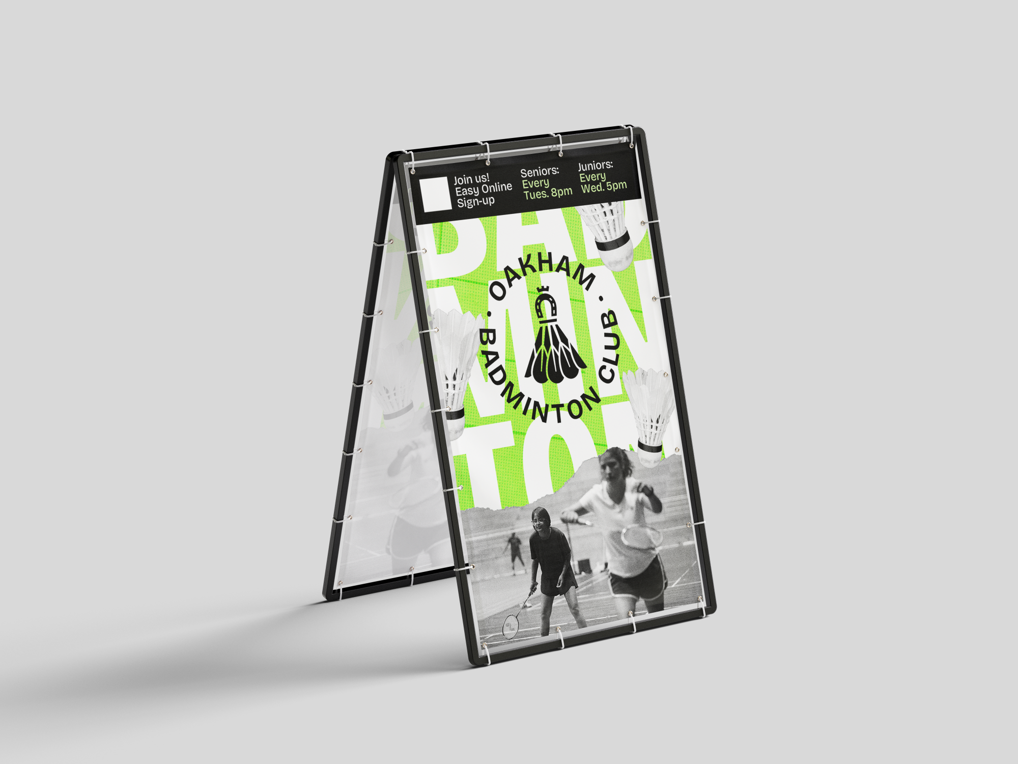
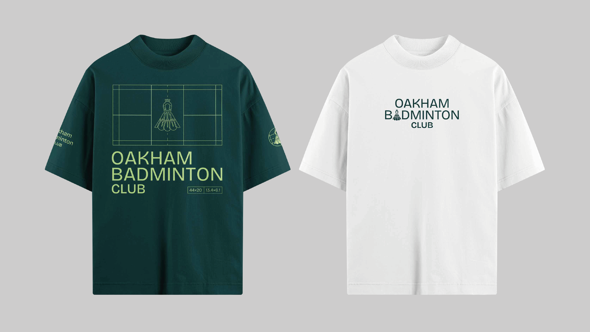
The identity needed to balance local tradition with pace and movement, while working practically across jerseys and future sports materials. The existing logo was centred on a shuttlecock, and a key challenge was evolving this into a more distinctive mark by introducing a meaningful connection to Oakham’s heritage without losing its sporting clarity.
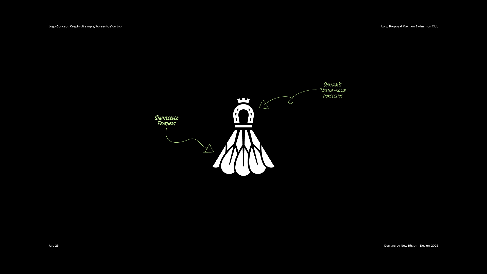
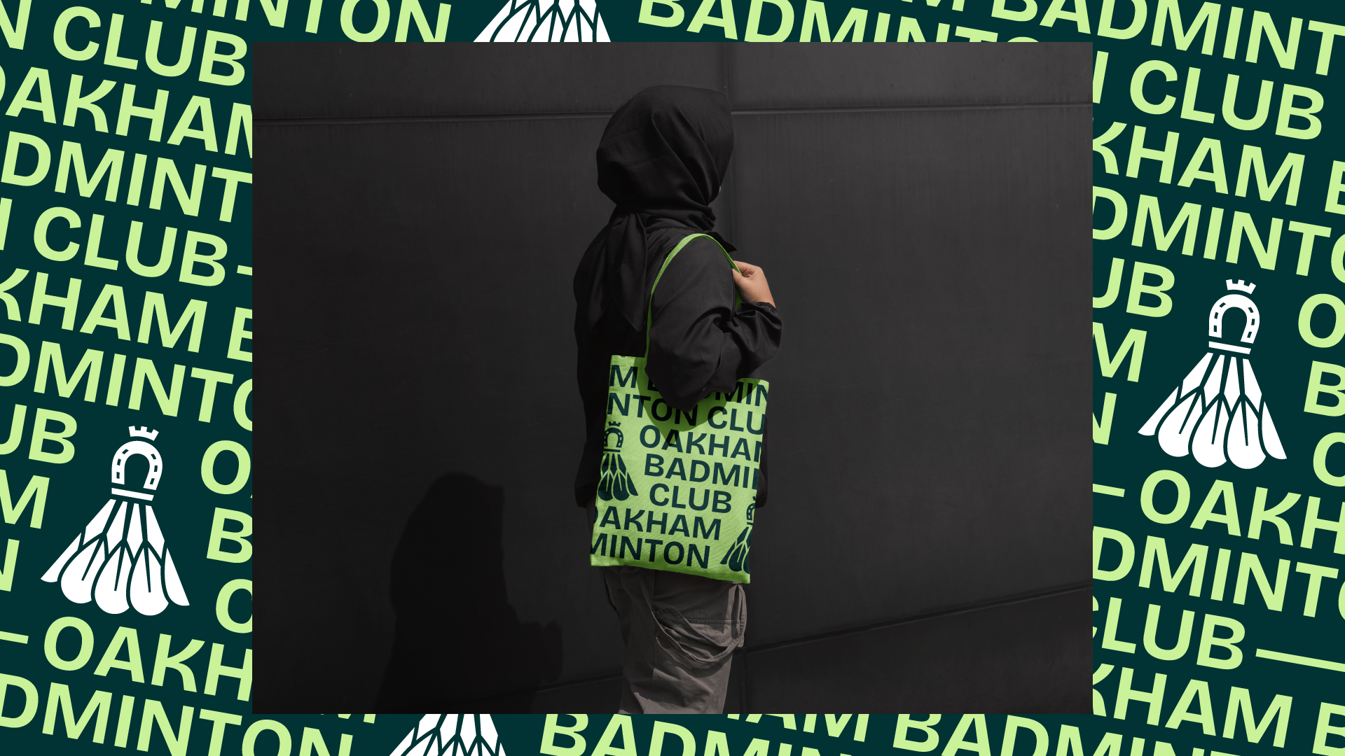
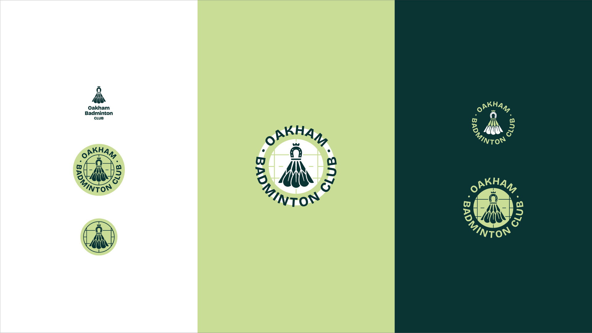
We developed a bold visual identity rooted in both badminton culture and Oakham’s local character. The logo system reimagines the shuttlecock by introducing the town’s iconic upside down horseshoe as the cork, creating a unique and recognisable symbol. A fresh colour palette of Oak Green, Leaf Green, and Court White brought energy and movement, supported by design elements inspired by badminton court layouts and repeat patterns. Bricolage Grotesque Variable added character and flexibility across applications.
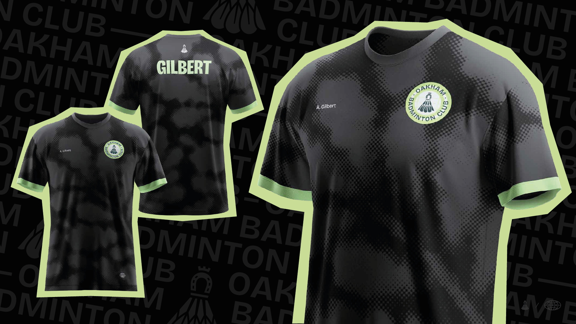
The final identity delivers a confident, energetic brand that feels both local and competitive. Since joining the league, the club has rolled the identity out across new team jerseys, with players responding positively to how the designs reflect both Oakham’s heritage and the spirit of the club.
.png)